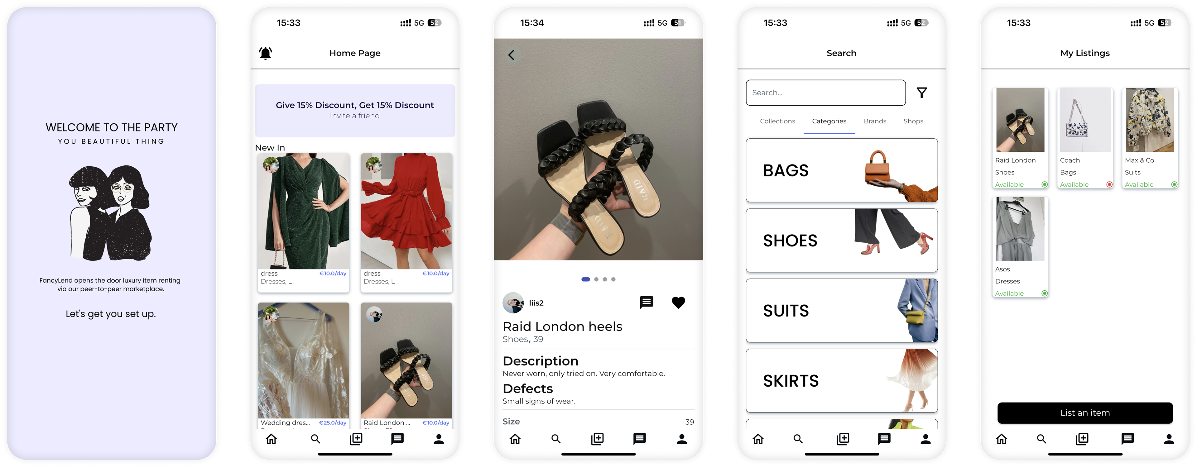
The starting point
The app was in a functional state, but in many cases with cluttered design solutions, crowded layouts and unpleasant user experiences.
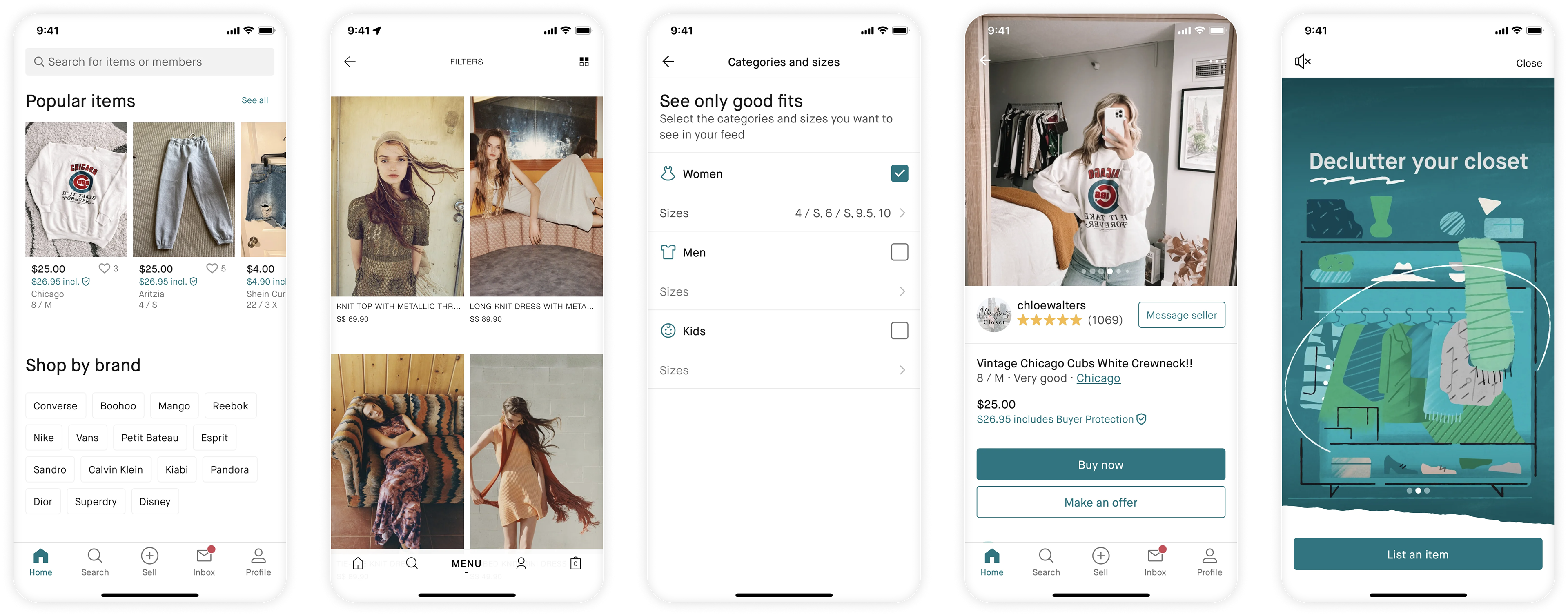
Inspiration
Inspiration was taken from apparel e-shops, as well as apps in a similar market segment.
Final design
The final design brought a new onboarding flow, more natural navigation from home screen to relevant rentable items, as well as a more logic setup for searching, browsing and filtering rentable items. Everything with a fresh, new look.
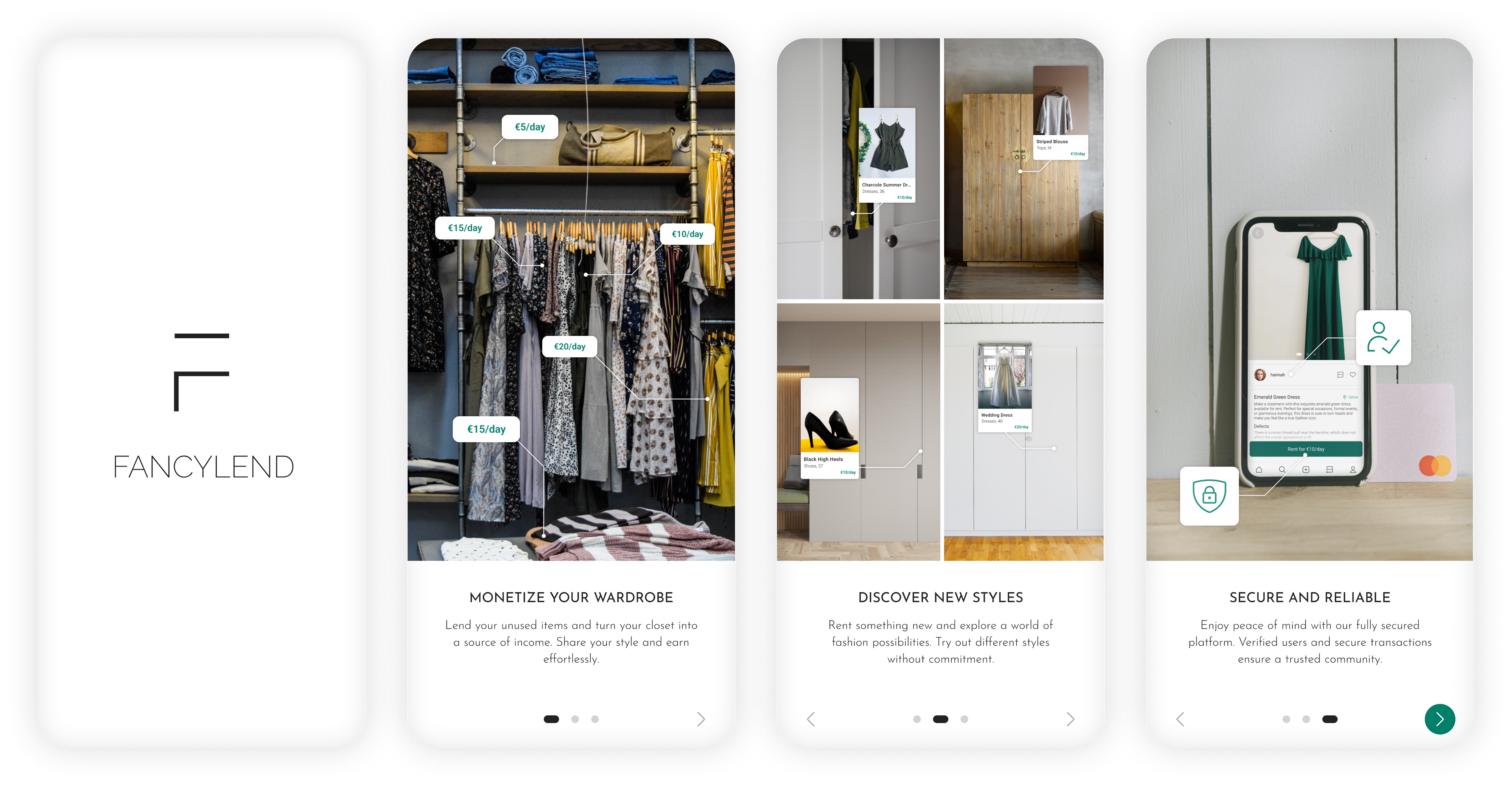
Onboarding screens
Illustrations are now replaced by real-life pictures, making the use cases relevant and comprehendible for new users of the service.
Home screen
The cards on the home screen are now much cleaner in their appearance, and features such as quick navigation to specific categories, and a location filter, makes the journey to renting your first item much more pleasant.
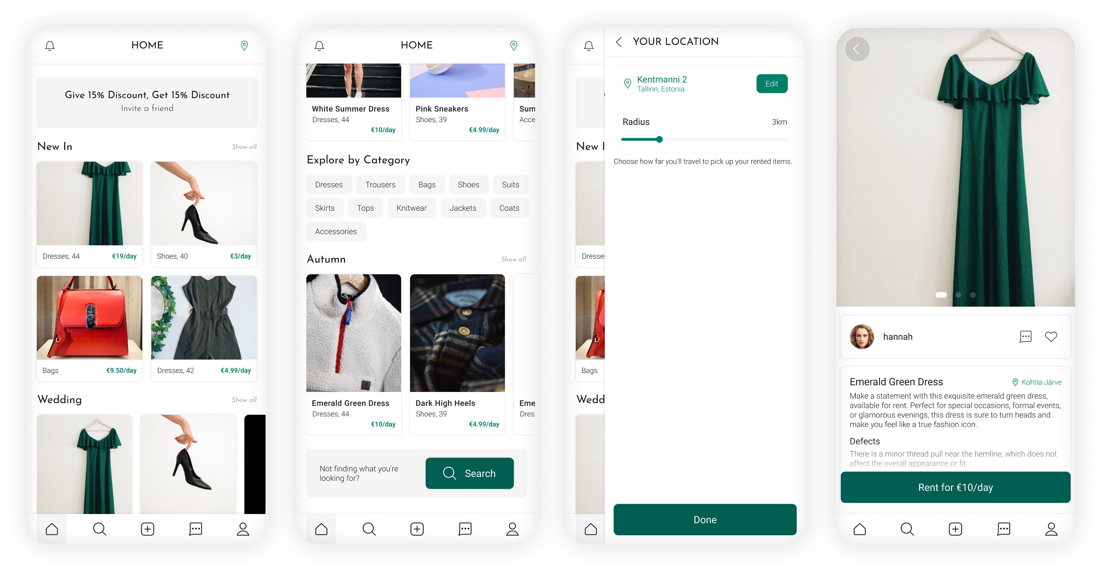
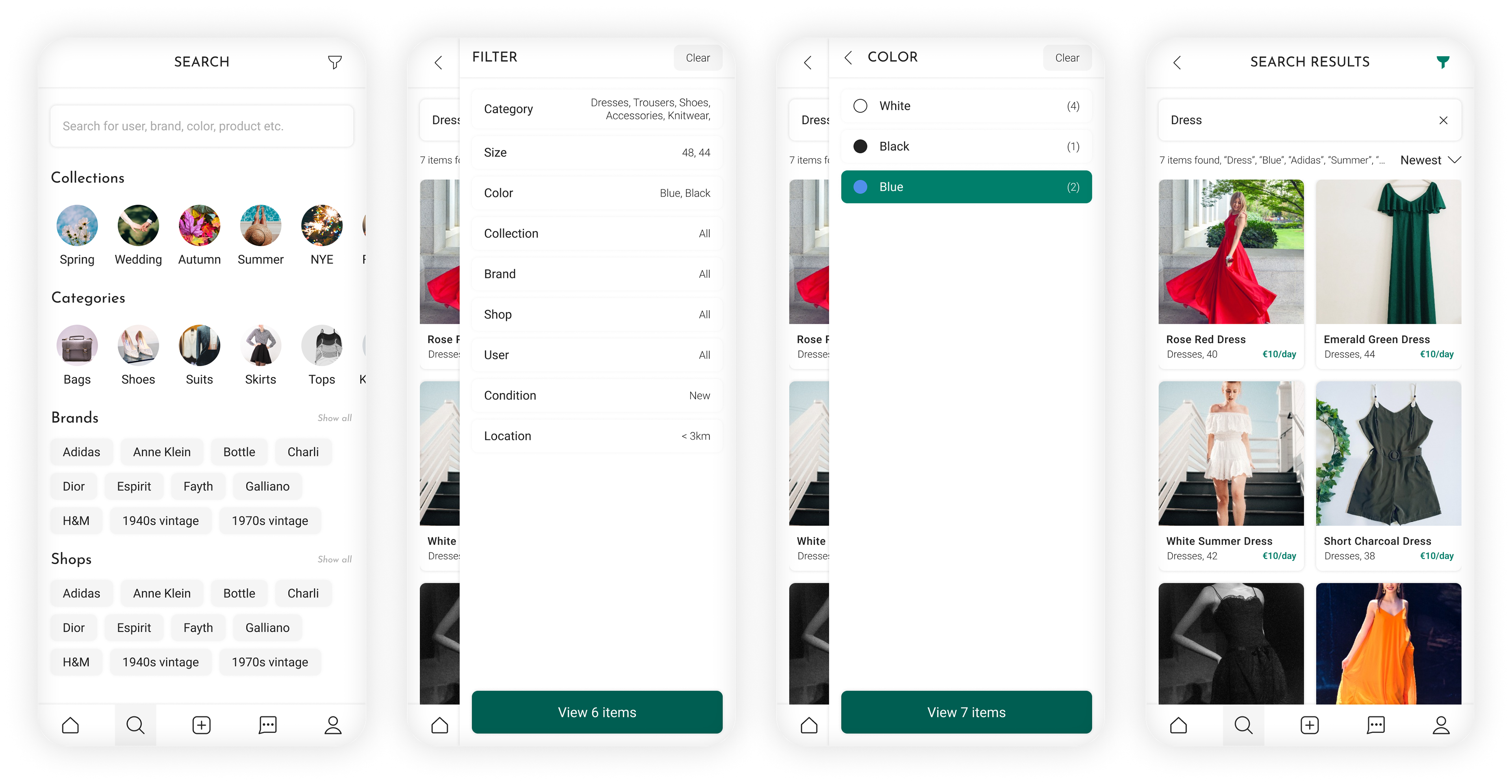
Explore
The first screen of the exploration part of the app is now clean and clear, making it possible to land where you want, with no scroll and just one tap. Furthermore, the filtering function makes it easy to navigate the selection of rentable items.